Creating digital stories that resonate and inspire

Tag: Color

Going Green: Pantone’s Color of the Year

Going Green: Pantone’s Color of the Year

There’s nothing like a new year to inspire a fresh start! Each year the Pantone Color Institute announces a new color that sets the trends in fashion, décor, and interior design. Pantone’s team from around the world typically spends the year studying trends in fashion, consumer products, social media, film, and technology. It looks for influences that best describe the current mood of society and picks a color to reflect those elements.

The color green has officially earned the green light from Pantone, and has been named its Color of the Year for 2017. Pantone’s Color of the Year for 2017 was recently revealed to be a bright shade of yellowish-green called Greenery.
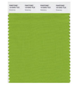
Greenery 2017 Pantone Color of the Year
The choice of the 2017 color is symbolic. As explained by Pantone, it is an attempt to reflect the mood of today’s consumers, who are more than ever in search of revitalization and rejuvenation.

A refreshing and revitalizing shade, Greenery is emblematic of new beginnings.

Greenery is a fresh and zesty shade that evokes the first days of spring when nature’s greens revive, restore and renew. This bright, yet natural, shade is illustrative of flourishing foliage and the lushness of nature and invokes a sense of growth and renewal.

Incorporating Greenery Into Your Home

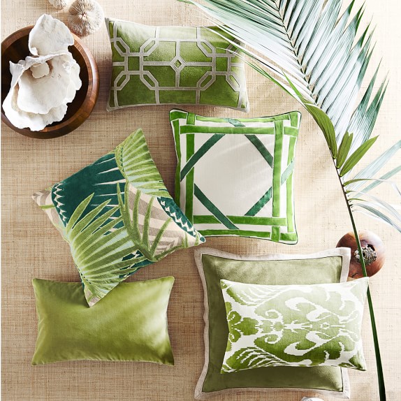
There are many different shades of green. Greenery is vibrant and verdant and characterizes the first signs of life that appear in spring. Pantone notes, “Greenery is nature’s neutral.” It’s a lively hue that channels energy, health, nature, renewal, and growth. Decorating with Greenery is sure to breathe life into any room.
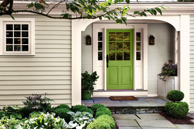
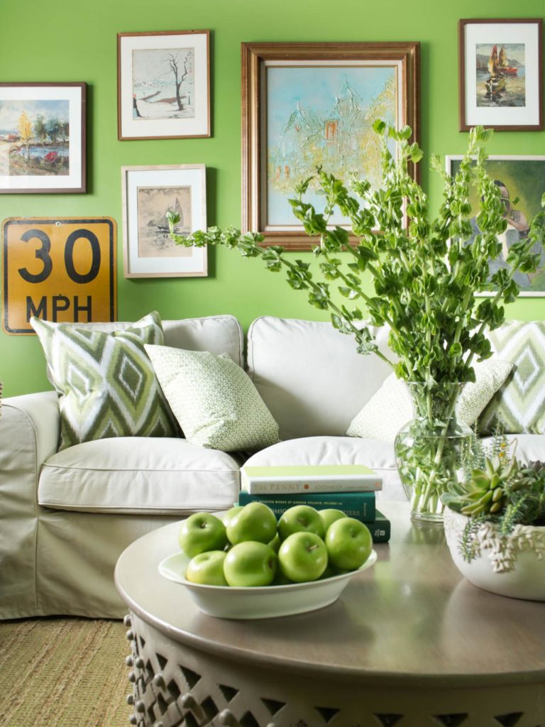
antone Greenery Decorating

Pantone Greenery Decorating

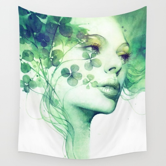
Greenery Tapestry

pantone-greenery-pillows


Greenery Elsewhere

In the automotive world, Mercedes unveiled a green car for 2018.
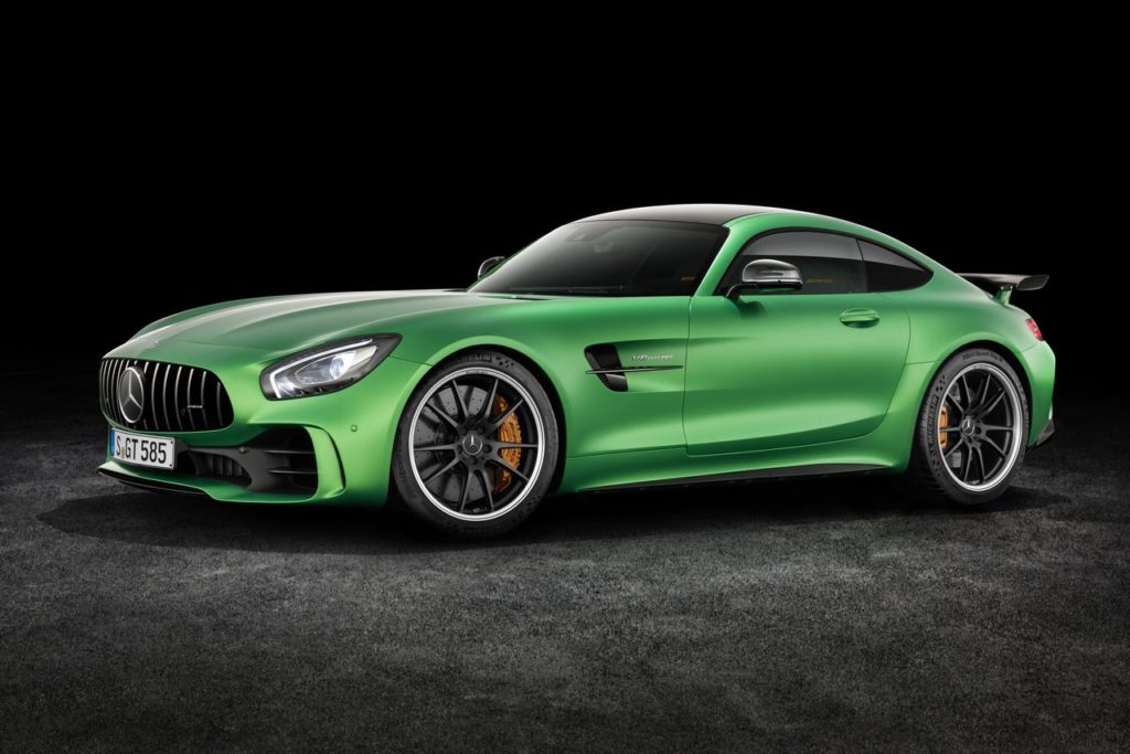
Green Mercedes Benz

There’s no doubt about it: Pantone chose a favorite this year with Greenery. It has the potential to breathe life into existing rooms; bring harmony and balance into a home; and lead trends in the fashion, art, and automotive industries, all of which will make it one of the more popular choices for Color of the Year.
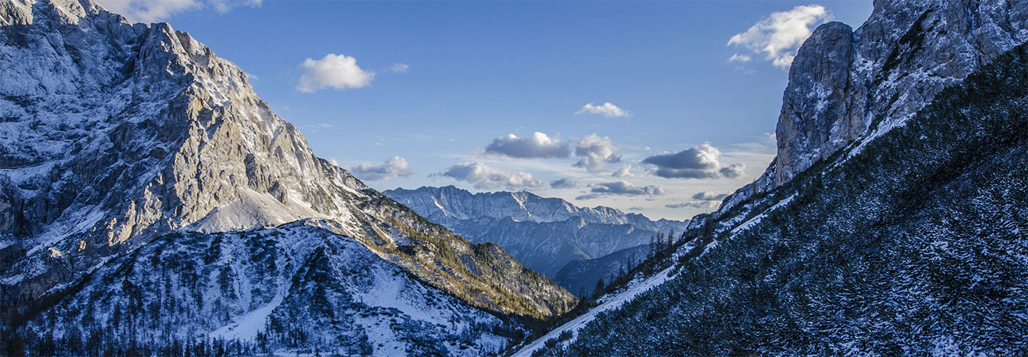
2016 Pantone Colors of the Year

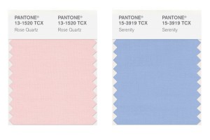
2016 Pantone Colors of the Year: Rose Quartz and Serenity

Each year, the Pantone Color Institute announces a new color that sets the trends in fashion, decor, and interior design. This year Pantone has taken an unprecedented step in choosing not one – but two complementary colors for the upcoming year. For 2016, Pantone surprised everyone with its choice of two colors: Rose Quartz and Serenity. The biggest surprise of all was that they paired the two together. It won’t be long before we see these pastel colors trickle into our daily lives. The colors are set to take center stage within fashion, beauty, fragrance, and home interiors in 2016.

2016 Pantone Rose Quartz and Serenity

After last year’s Color of the Year – the dark and earthy Marsala – Rose Quartz and Serenity are a refreshing change. These colors are a sharp turn after several years of bold colors such as Radiant Orchid, Emerald, and Tangerine Tango. Evoking a sense of calmness, fluidity and balance, the fusion of these shades provide the perfect antidote to busy modern life.

The choice of the 2016 colors is symbolic. As explained by Pantone, it is an attempt to reflect the moods of today’s consumers, who are more than ever in search of life balance, calmness and well-being. The pairing of Rose Quartz and Serenity, commonly known as pale pink and baby blue, radiates a calm and relaxing atmosphere and is an antidote for the modern-day hectic lifestyles.

These peaceful pastels offers a harmonious blend of warm and cool. The colors balance and complement each other but blend beautifully. Rose Quartz is a gentle tone that conveys compassion. It’s the color of flowers and blushing cheeks. Serenity, on the other hand, is airy like the expanse of the blue sky. It brings feelings of relaxation even in tumultuous times.

2016 Pantone Rose Quartz and Serenity

When combined, the colors look like something you’d pick to paint the walls of a nursery, which is exactly what Pantone was going for. But, this doesn’t mean you need to decorate your home like Barbie’s Dream House. When you use these pastels, there are subtle approaches that you can take to incorporate these shades into your interior design.

Decorating with Rose Quartz and Serenity

How is Each Year’s Hottest Hue Chosen?

The criteria for selecting Pantone’s color of the year is not an easy task because the shade needs to work worldwide. This makes the selection process a difficult task.

The color of the year requires careful consideration. Trends are rarely decided by individuals. Instead, they are decided by a committee. One of the most influential committees is a group of 10 people whose names are secret. They meet in Europe twice a year at the invitation of Pantone, a company based in Carlstadt, New Jersey, whose only business is color. This committee of experts formed by Pantone spends months studying the shades used most in the various art disciplines, design, and even the entertainment industry. This first analysis yields a color family, which must also reflect an attitude and a general mood. From there, they go on to select the winner.

In conclusion, the possibilities are endless when decorating with these trendy hues. It’s just a matter of time until the design and fashion industry respond by incorporating these shades into their paint color palettes. In fact, today I was out shopping and have already begun seeing these shades in stores and magazines. Of course, consumers can either go with the trend or wait for a new year.

The Importance of Color

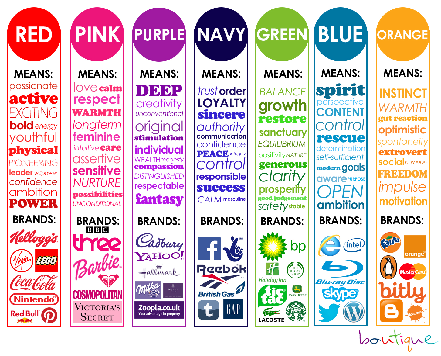
Importance of Color - Branding

The Importance of Color

Color is an important element in marketing, branding, web design, or even interviewing for a job. Research has shown that people react differently to colors. Color can sway thinking, change actions, and cause reactions. It can soothe, raise your blood pressure, or even make you hungry. You can drive almost anywhere and assume that a traffic light has red, amber, and green; that red means stop and green means go.

Colors can evoke connotations like aggressive, soothing, cheerful, luxurious—and those connotations differ across cultures.

Color is a powerful form of communication.

Color and its Meanings

Black is a mysterious color that signifies power, strength, authority, and commands respect. It is simple, elegant, and speaks of class.

Blue is a favorite color for businesses and suggests stability. It inspires confidence and is the second most powerful color. Darker shades of blue represent authority while brighter hues signify trust and security. Paler shades imply peace, loyalty, and wisdom.  Blue causes a calming effect.

Gray is a cool, neutral, and balanced color and is associated with conservative qualities and considered traditional, business-wise symbolizes high-tech and suggests authority, practicality, earnestness, and creativity.

White is the color of innocence, cleanliness, purity, and neutrality. For this reason, many websites use white as a background. It is considered to be the color of perfection. White is a brilliant color and works well for contrast but, that same brilliance can make white hard to focus on and may cause eye fatigue and can be blinding at times.

Brown is an earthy color and is often associated with nature, warmth, and coziness. It suggests richness, stability, reliability, dependability, and approachability, and wholesomeness.

Red signifies power. It’s an emotionally intense color that ignites thoughts of love, passion, and danger. This can have the effect of raising blood pressure. In contrast, red is also the color of alarm and is used as a shorthand sign for danger.

Green is associated with the color of nature, good health, and money. It is seen as calming and is associated with many foods.

Yellow is an energetic and bright color. It represents sunshine, happiness, and warmth. Yellow is associated with creativity and is one of the most difficult colors to focus on visually.

Orange exudes confidence, cheerfulness, hot, fiery, and excitement.  It’s often associated with vibrancy, tropics, and instills a sense of fun and pleasure. Orange appeals to a wide range of people.

Purple is often associated with royalty, nobility, luxury, power, creativity, and ambition. It conveys wealth, extravagance, and creativity.

Color matters and is definitely something to consider whether you’re going on a job interview, designing a website, a logo, or marketing a product.

Powered by WordPress & Theme by Anders Norén