2016 Pantone Colors of the Year: Rose Quartz and Serenity
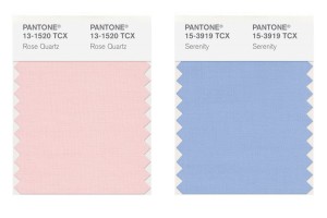
Each year, the Pantone Color Institute announces a new color that sets the trends in fashion, decor, and interior design. This year Pantone has taken an unprecedented step in choosing not one – but two complementary colors for the upcoming year. For 2016, Pantone surprised everyone with its choice of two colors: Rose Quartz and Serenity. The biggest surprise of all was that they paired the two together. It won’t be long before we see these pastel colors trickle into our daily lives. The colors are set to take center stage within fashion, beauty, fragrance, and home interiors in 2016.

After last year’s Color of the Year – the dark and earthy Marsala – Rose Quartz and Serenity are a refreshing change. These colors are a sharp turn after several years of bold colors such as Radiant Orchid, Emerald, and Tangerine Tango. Evoking a sense of calmness, fluidity and balance, the fusion of these shades provide the perfect antidote to busy modern life.
The choice of the 2016 colors is symbolic. As explained by Pantone, it is an attempt to reflect the moods of today’s consumers, who are more than ever in search of life balance, calmness and well-being. The pairing of Rose Quartz and Serenity, commonly known as pale pink and baby blue, radiates a calm and relaxing atmosphere and is an antidote for the modern-day hectic lifestyles.
These peaceful pastels offers a harmonious blend of warm and cool. The colors balance and complement each other but blend beautifully. Rose Quartz is a gentle tone that conveys compassion. It’s the color of flowers and blushing cheeks. Serenity, on the other hand, is airy like the expanse of the blue sky. It brings feelings of relaxation even in tumultuous times.

When combined, the colors look like something you’d pick to paint the walls of a nursery, which is exactly what Pantone was going for. But, this doesn’t mean you need to decorate your home like Barbie’s Dream House. When you use these pastels, there are subtle approaches that you can take to incorporate these shades into your interior design.

How is Each Year’s Hottest Hue Chosen?
The criteria for selecting Pantone’s color of the year is not an easy task because the shade needs to work worldwide. This makes the selection process a difficult task.
The color of the year requires careful consideration. Trends are rarely decided by individuals. Instead, they are decided by a committee. One of the most influential committees is a group of 10 people whose names are secret. They meet in Europe twice a year at the invitation of Pantone, a company based in Carlstadt, New Jersey, whose only business is color. This committee of experts formed by Pantone spends months studying the shades used most in the various art disciplines, design, and even the entertainment industry. This first analysis yields a color family, which must also reflect an attitude and a general mood. From there, they go on to select the winner.
In conclusion, the possibilities are endless when decorating with these trendy hues. It’s just a matter of time until the design and fashion industry respond by incorporating these shades into their paint color palettes. In fact, today I was out shopping and have already begun seeing these shades in stores and magazines. Of course, consumers can either go with the trend or wait for a new year.
